Using backdrop-filter for overlays
How to use backdrop-filter to make overlays that adapt to the current background.
Background
Creating overlays on top of images (and videos) often entails using some sort of drop shadow effect. For example, using white icons requires a shadow to be visible against near-white backgrounds. With backdrop-filter, you can create overlays that adapt to the background color instead of (or in addition to) using a shadow.
What the Effect Looks Like
Before we dive into the code, let's look at what the effect we're aiming for looks like. We will compare it to a simple background-color against some different backdrops. The example is based on a carousel that has pagination dots, indicating the user's current position in the carousel. The background is transparent in both approaches to allow the backdrop to show through.
First let's look at an example where our dots may match the current background color.
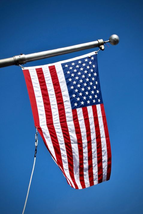
backdrop-filter. Photo by Jordhan Madec on Unsplash.
For this example, both approaches work well when need to distinguish the white dots from a light background, for example the white stripes on the flag. Next we'll look at a dark background.
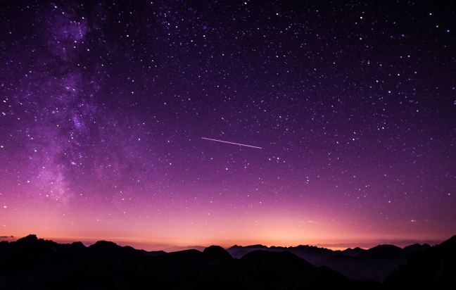
backdrop-filter. Photo by Vincentiu Solomon on Unsplash.
In the example above, our simple transparent background color disappears into the darker portions of the image. Our backdrop-filter based approach stands out more cleanly against the dark background. Finally, let's look at how this behaves against some solid backgrounds.
#fff.
backdrop-filter, against a background of #fff.
Against a white background, the backdrop-filter approach has a bit more contrast between the white selected state and the backdrop. If we were to make the simple backdrop darker (by increasing the opacity) to improve the contrast here, it would look too dark on other backgrounds.
#000.
backdrop-filter, against a background of #000.
Against a black background, the simple approach is not visible at all. Our UI experience feels more consistent when we can see the overlay background.
backdrop-filter, against a background of #2e2e2e.
This approach does have some limitations however. For example, for some value of gray (depending on the backdrop/background CSS) the background is not easily distinguishable from the backdrop, as seen above. In practice, you are more likely to encounter a very dark or black background than such a shade of gray. You can still add a box-shadow to make this stand out more if you want to. Note that you will want to add it to an element that stacks on top of any elements with backdrop-filter. This is to avoid the shadow affecting the blur and thus the overlay color.
Example Code
The examples above use the following HTML and CSS for rendering the container with the dots. We'll break this down next.
<div class="dots">
  <div class="dots-frosted-glass"></div>
  <div class="dots-backdrop"></div>
  <div class="dots-background"></div>
  <div class="dot"></div>
  <div class="dot"></div>
  <div class="dot dot-selected"></div>
  <div class="dot"></div>
</div>
.dots {
position: absolute;
z-index: 0;
bottom: 12px;
display: flex;
flex-direction: row;
justify-content: center;
padding: 6px;
}
.dots-frosted-glass,
.dots-backdrop,
.dots-background {
position: absolute;
top: 0;
left: 0;
width: 100%;
height: 100%;
border-radius: 20px;
}
.dots-frosted-glass {
-webkit-backdrop-filter: blur(2px);
backdrop-filter: blur(2px);
}
.dots-backdrop {
-webkit-backdrop-filter: blur(12px) invert(1) grayscale(0.8) brightness(0.6);
backdrop-filter: blur(12px) invert(1) grayscale(0.8) brightness(0.6);
opacity: 0.5;
}
.dots-background {
background-color: rgba(0, 0, 0, 0.4);
}
.dot {
z-index: 1;
height: 8px;
width: 8px;
margin: 0 4px;
border-radius: 50%;
background-color: rgba(255, 255, 255, 0.6);
}
.dot-selected {
background-color: white;
}What is backdrop-filter?
This relatively new CSS property (Safari 9+, Chrome 76+) allows for applying effects to the content underneath an element or the backdrop. This enables many cool effects, for example iOS's frosted glass effect. It allows you to apply various filter functions to operate on the pixels in the backdrop. See the introductory blog post for more information on why this was added and what you can use it for.
Breaking Down the CSS
The most important parts of the CSS are:
.dots-frosted-glass {
  -webkit-backdrop-filter: blur(2px);
  backdrop-filter: blur(2px);
}

.dots-background {
  background-color: rgba(0, 0, 0, 0.4);
}

.dots-backdrop {
  -webkit-backdrop-filter: blur(12px) invert(1) grayscale(0.8) brightness(0.6);
  backdrop-filter: blur(12px) invert(1) grayscale(0.8) brightness(0.6);
  opacity: 0.5;
}
These define how the background for our dots will look. The rest of the CSS is mostly styling for dots and some positioning. Starting with the backdrop-filter, we first have a blur(12px). This applies a Gaussian blur with a radius of 12px. This allows us to create a background that contains a rough average color of the backdrop at any given point.
.dots-backdrop {
  -webkit-backdrop-filter: blur(12px);
  backdrop-filter: blur(12px);
}
The value of 12px was chosen to not be greater than the distance to the bottom of the image at any point. If the value were larger, the background of the page itself would factor into the calculation. The larger the value we use, the more gradual changes in the background will be. Too large of a value would potentially pull in colors from farther away from our overlay, which may not be relevant. With a Gaussian blur, farther pixels have less impact than closer pixels, but we may be better off not including them.
The next step is to apply an inversion effect. This allows us to create a light background against black, and a dark background against white. This is done using invert(1) in our backdrop-filter list.
.dots-backdrop {
  -webkit-backdrop-filter: blur(12px) invert(1);
  backdrop-filter: blur(12px) invert(1);
}
We do have some extra (inverted) color in our background that we probably do not want. We can reduce the effect of the color using the grayscale filter, with the value determining how much color we retain. For our example, we will use grayscale(0.8) so that we are still keeping a bit of the color, but you can try changing the amount to see what looks good.
.dots-backdrop {
  -webkit-backdrop-filter: blur(12px) invert(1) grayscale(0.8);
  backdrop-filter: blur(12px) invert(1) grayscale(0.8);
}
The next step is to tone down the brightness, as this color contrasts much more than we want to. Our example uses brightness(0.6).
.dots-backdrop {
  -webkit-backdrop-filter: blur(12px) invert(1) grayscale(0.8) brightness(0.6);
  backdrop-filter: blur(12px) invert(1) grayscale(0.8) brightness(0.6);
}
Now we want to introduce some opacity. This can be done using the opacity() filter function. However, due to a bug in Chrome, this currently does not work correctly. To work around this, we have pulled the backdrop-filter CSS into a separate element with an opacity of 0.5.
.dots-backdrop {
  -webkit-backdrop-filter: blur(12px) invert(1) grayscale(0.8) brightness(0.6);
  backdrop-filter: blur(12px) invert(1) grayscale(0.8) brightness(0.6);
  opacity: 0.5;
}
Since we use white dots, we want to increase the contrast by mixing in a constant, dark color. This is done by the .dots-background element.
.dots-background {
  background-color: rgba(0, 0, 0, 0.4);
}
Lastly, let's add a frosted layer underneath so we can have the frosted glass look. This is done with the .dots-frosted-glass element. You can change the blur value here depending on how clearly you want the backdrop features to show through.
.dots-frosted-glass {
  -webkit-backdrop-filter: blur(2px);
  backdrop-filter: blur(2px);
}
You can try playing with the blur, grayscale, brightness, opacity and background-color values to see how the effect changes on different backgrounds. For example, by increasing the brightness value, you can make the background lighter and stand out more on dark backgrounds.
Perception and Color
A lot of what we perceive as color has to do with the context in which something appears. You may have seen various optical illusions before where a single color appears differently depending on the surrounding colors. For example, the figure below contains two gray squares of the same color, but the one against the dark background may appear lighter.
The backdrop-filter approach outlined here has a similar effect. The perceived color across light and dark backgrounds looks similar, even though the actual colors are different. The next figure uses the same backdrop colors with the backdrop-filter approach for the center squares. While the square on the dark background is the same color as before, the square on the light background is significantly lighter.
In the example below, the overlay looks to be roughly uniform in color against the gradient background. Using a solid connecting color, we can see the right side is darker. The perceived color of the overlay is more similar than if we had simply used a solid non-transparent color.
Conclusion
The backdrop-filter property can be used to create some really nice looking overlays for images and even videos. The simple blur function can be used to create a frosted glass effect. Using invert and a few other filters, we can make the overlay color work well across both light and dark backgrounds, giving a consistent experience.